
i want hue
Colors for data scientists. Generate and refine palettes of optimally distinct colors.
Colors for data scientists. Generate and refine palettes of optimally distinct colors.
Distributing colors evenly, in a perceptively coherent space,
constrained by user-friendly settings, to generate high quality custom palettes.
Which is the best way to generate random colors? This was my starting point.
There are few common ways to write colors:
Many libraries allow the conversion of any color in these four writings (d3.js for instance). So a random colors generator may use the RGB space as well as the HSV space. HSV or HSL seem to make more sense, since they fit to how we think colors. I also read this opinion on the web. But I had to test it. So I developed a tool for monitoring what happens when you generate random colors. Here are some observations I made.
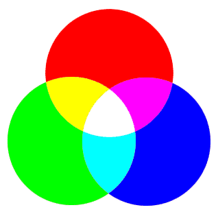
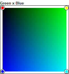
Here is a palette of 12 HSL random colors.
Some colors look very similar, for instance the dark colors. Despite generating only 12 colors, several colors might be mistaken and it is a problem. We want to use the generator for data visualization, so our primary goal is to get very distinct colors.
#451228
#13D907
#F9F4FC
#41039B
#47544E
#122B53
#59DA63
#7B1386
#4B381C
#CDBCD0
#EAEAEA
#B1CDE4
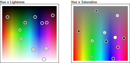
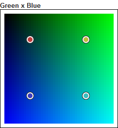
This is how these 12 colors are distributed in the HSL space.
The distribution is right, and the similarity of some colors is not an effect of randomness. It is just that the HSL color space has bad properties. Look at the Hue x Lightness projection. The upper-left corner and the the upper-right corner have the same color (black). Despite being distant, they look the same. The random colors are distant in the space but not for our perception. Colors with a low lightness will all look the same, whatever their hue. The same with high lightness colors, and low saturation colors.
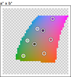
Here is now a palette of 12 RGB random colors.
This palette is visibly better. We have less similar colors. The RGB space has better properties.
#DBA714
#391FEA
#46385C
#E5154B
#3E9A71
#3495F5
#57510C
#D9B182
#8625B8
#83CA5D
#6252A1
#DB5E3A
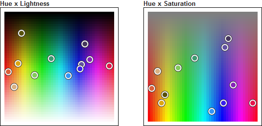
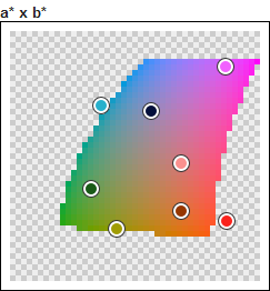
Here is the projection of this palette in the HSL space.
The colors are not located in the dark area, in the light area, or the grey area. They tend to occupy the areas where we see more varied colors. Intuitively, this is what we expect in order to get perceptively varied colors.
The randomness is not the same depending on the color space used.
Then, which is the best color space for generating random colors?
The CIE L*a*b* color space includes all perceivable colors and is intended to be perceptually uniform. That is, we can interpret the distance in this space as a perceptive distance. If two colors are close, then they will look similar. On the contrary, distant colors will be perceived as distinct. This is the property we need.
But there is something special with this color space: it has holes. Only certain coordinates correspond to actual colors. This makes things a little bit more complicated, but we can get over it.
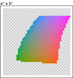
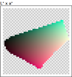
You can see here what it looks like.
What does this color space change? It takes in account that the yellow is perceived very light, and that the purple looks dark on the contrary. That is why the L*a*b* version of the lightness has a star: lightness*. In a data visualization perspective, it stands for the unbiased lightness. This color space also gives more room to saturated colors compared to dark, clear or grey colors. All the colors look the same when they are very dark. That is why the dark colors occupy a lesser area than the fully saturated colors.
We will use the CIE L*a*b* color space as the reference for the evaluation of colors distribution.
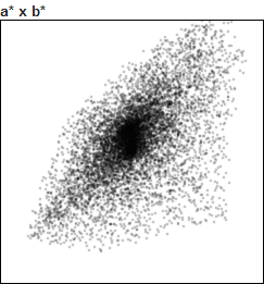
If we generate 10000 random colors in this color space, we obtain this distribution.
We can now compare the random distributions of other generators.
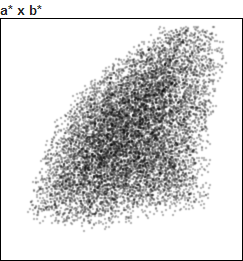
HSL random colors represented in CIE L*a*b*
We clearly see how the random HSL colors concentrate in the central area. This area corresponds to the dark, grey and light colors (desaturated colors). It visualizes the many similar desaturated colors found in our first random example.
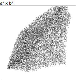
RGB random colors represented in CIE L*a*b*
The distribution is very close to the reference. We can see here that RGB random colors are very satisfying, even if CIE L*a*b* random colors are even better.
If you have to use simple generator, use RGB random colors, they are not much different from the best you can expect!
The next idea is to prevent similar colors. We place each color depending on the others. We can achieve this goal with two different algorithms: k-Means and Force Vector.
Force Vector is the simplest. It makes all the colors repulse, so that they tend to separate at the maximum in the color space. If we generate 8 colors and make them repulse in the RGB color space, which is basically a cube, they tend to go in the corners.
8 colors RGB Force Vector palette
So we obtain black, white, the 3 primary colors, and the 3 secondary colors!
#00FF00
#0000FF
#FF0000
#FFFFFF
#000000
#FFFF00
#FF00FF
#00FFFF
The same algorithm in the CIE L*a*b* space gives different results, since the space itself has a twisted shape. The colors are nevertheless very distinct as well.
8 colors L*a*b* Force Vector palette
#A09C04
#F161FE
#27B0CC
#FA231D
#04103B
#FA918F
#1A5A18
#963700
Another way to generate evenly distributed colors is to clusterize the color space. We use the k-Means algorithm to do so. It aims at finding k distinct areas in the color space, and the palette is made of all the centers of these areas.
8 colors RGB k-Means palette
Clustering the RGB cube in 8 will also give 8 colors, but they will not be on the edge of the cube. This is the biggest difference between k-Means and Force Vector: k-Means produces less distant colors.
#BE3CBE
#3CBE3C
#3C3C3C
#BE3C3C
#3CBEBE
#BEBE3C
#3C3CBE
#BEBEBE
Like before, the CIE L*a*b* space gives different results since it has a different shape.
8 colors L*a*b* k-Means palette
#C7743B
#9B4DCA
#93C4A2
#513363
#94C64D
#514C34
#C45271
#969CC6
Next step: we want to apply constraints to the color generation. The goal is to get control over the type of colors obtained. For instance, we want to limit the saturation in order to avoid a distracting effect.
If RGB fits to how screens produce colors, if CIE L*a*b* fits to how we perceive colors, HCL fits to how we think colors. It is like HSL, but perceptively unbiased. The idea behind this color space is to use the CIE L*a*b* but with a separate Hue dimension. So HCL has the regular Hue, an unbiased saturation called Chroma, and the (unbiased) Lightness* from L*a*b*.
This clever process has been (re-)discovered by Gregor Aisch. This post explains the whole process. Seriously, take a look at this work. Also, Gregor Aisch coded the Chroma.js library that I used so much to build this tool.
Important note about the HCL terminology: the HCL color space was initially called CSL for "chroma / saturation / lightness". The post above is about "CSL": this is actually what we call HCL (like the present Chroma.js lib).
The HCL color space is more twisted than CIE L*a*b* and still distorted (the desaturated colors are not in a single area), but it is the best way to set the conditions limiting the color space.
We see very well the effect of the unbiased lightness: yellow is not too light and indigo not too dark. The whole looks so smooth!
Just by setting a range for Hue, a range for Chroma and a range for Lightness*, we can restrain the L*a*b* color space. We just test if a given L*a*b* color, once converted in HCL, is in the specified ranges. The force vector will just prevent a color from being pushed out of these boundaries. The k-Means will restrain its sampling of colors to be clusterized (so it is even quicker).
So, just to be clear:
L*a*b* is used for computations, while HCL is used by the user to filter colors.
Here are some examples of color subspaces that you can use to build palettes. You will see that because the color space is twisted, the Chroma affects the Hue and the Lightness*, and vice-versa.
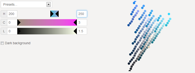
Hue from 200° to 250°
170 blue colors. Since there is no constraint on chroma or lighness, we have some black, grey and white.
Selecting a range of hues cuts the L*a*b* space like a slice of pie.

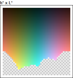
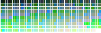
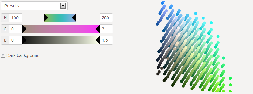
Hue from 100° to 250°
577 blue-green colors. Of course, a wider range has more color samples.
It is like a big slice of color space. The bottom of the space is dark while the top is light, and the center is grey while the border is colorful.
We sample the full CIE L*a*b* color space in 1782 colors.
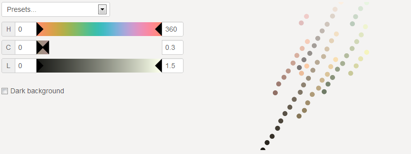
Chroma from 0 to 0.3
66 desaturated colors. These colors may be slightly green or orange. This is due do the fact that these hues are perceived less saturated.
Selecting a low chromas keeps only the very center of the color space.

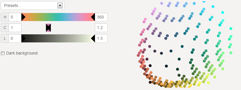
Chroma from 1 to 1.2
215 well saturated colors.
Selecting a close range of chromas makes the shape of a bowl. The bowl is small if the chromas are low, the bowl is large if the chromas are high.
Chroma above 2
363 over-saturated colors. These colors are blue to purple, with a touch of green. Only these colors are perceived with such a high saturation.
Selecting high chromas digs a big hole in the color space. But because its shape is not even, only certain hues remain.
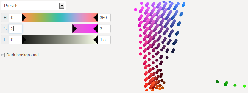
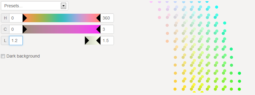
Lightness* above 1.2
196 very light colors. These colors include a lot of yellow, since this color is perceived lighter.
Selecting a certain lightness selects a horizontal plan of the space.
As a data scientist I want:
Mastering palettes allows some solutions:
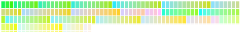
Here is an example of satisfying settings for a small amount of colors.
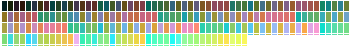
Chroma < 0.3 and Lightness* > 1.2: 19 very soft colors.

You will never have 2 similar colors at the same time.
Here is another example, where you want to put an element in exergue.
The same color space is used for all items but one, that is found in the following:
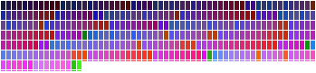
0.4 < Chroma < 0.6 and 0.8 < Lightness* < 1: 32 colors.

If we had a dark background, we would have to find other color spaces, respectively:
Chroma < 0.4 and 0.6 < Lightness* < 0.8: 14 colors.

0.4 < Chroma < 0.8 and 1 < Lightness* < 1.2: 76 colors.
